Here, I share my perspectives on technology, creativity, and life’s intricate struggles, weaving insights from my standpoint as a designer. Welcome to My Thoughts — My personal canvas for thoughts that inspire, inform, and connect.
Sometimes a web project might require that some sections maintain their in-line (or one-line) structure. On devices with limited width, this means that elements inside the horizontal scroll container become “swipeable.”
You can achieve this in Elementor by following the guide below.
First, you need at least, two main elements here; The scrollable container, and its contents.
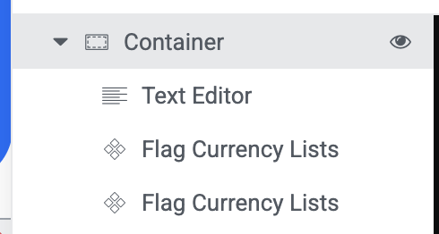
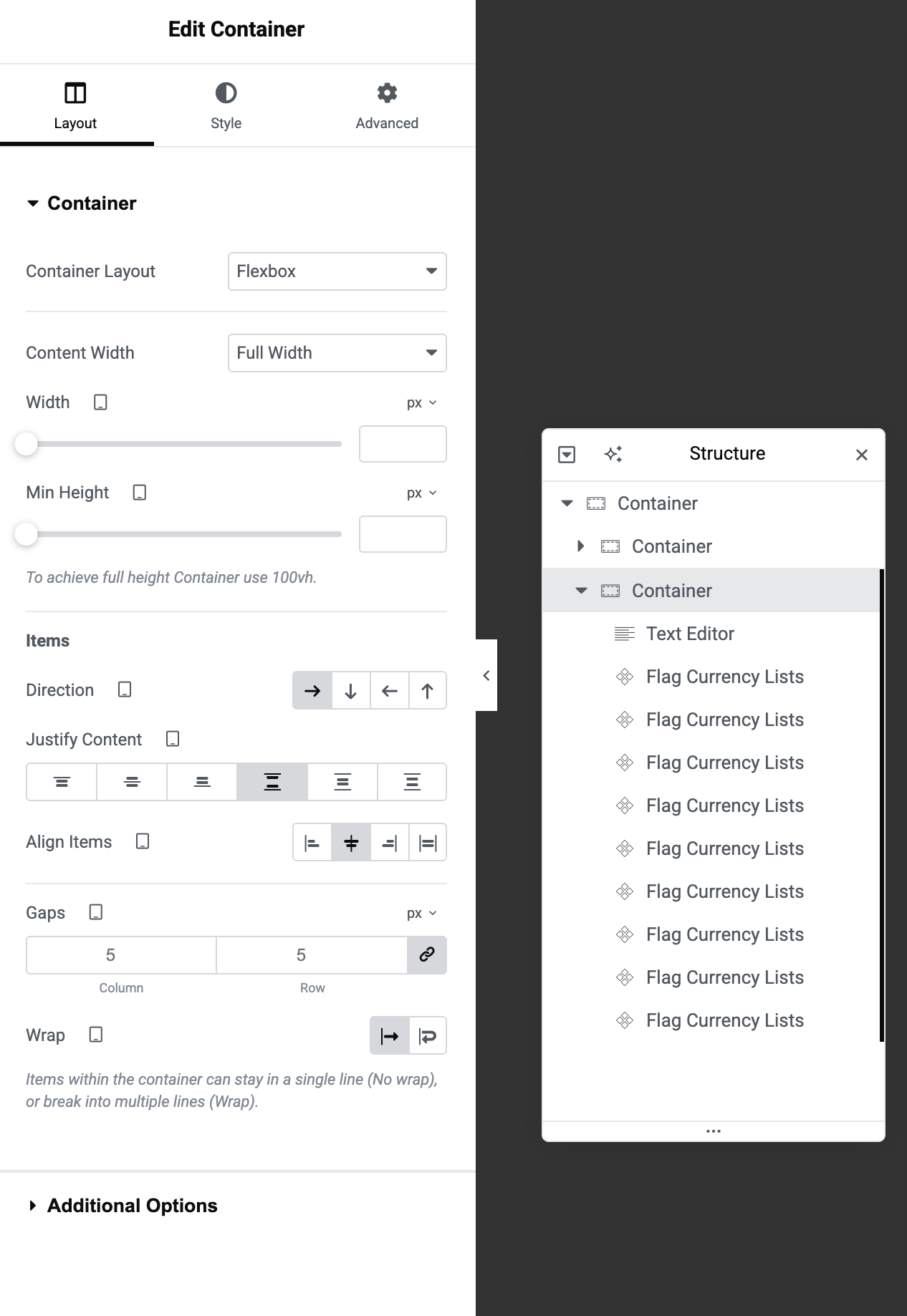
On the Structure Panel, you should have something like this;
Here are the exact things to do.
STEP ONE: Click the parent container. Then click “layout”. Ensure that the direction goes from left to right as seen in the screenshot below, then select “No wrap”.
This forces the content of the container in-line, but the problem with it is that the content becomes squeezed. Which leads us to STEP TWO.
But before we move to STEP TWO, make sure you are still on the parent container, click “Advanced” and scroll down until you see “Custom CSS”. Paste this CSS Code:
STEP TWO: Now that we are done with the parent container. Click each single item (or widget inside that container,) and do this same thing (shown below) for each of them to get rid of the squeeze and make them stretch to fit their actual width.
Click one widget at a time, then click the “Advanced” tab then “Custom CSS”. Then insert this CSS Snippet:
selector {
  flex-shrink: 0;
}
This would make the widget stretch to its real width instead of squeezing to fit in the container.
Repeat this same thing for every widget inside that container. That’s it. Simple and flexible!
Welcome to the new year 2026, the year of big, big tax reforms in our great country. As we all know, several key changes were made in the revenue collection sector in Nigeria last year by President Bola Ahmed Tinubu, and it’s only important that we take steps to stay compliant. As a creative professional, whether you work as a freelancer or as a full-time worker in an organization, you are now mandated to pay income taxes. To begin, you will now need a validated “Personal” TIN.
As of January 2026, the process for obtaining a TIN in Nigeria has been simplified and integrated with existing national identification systems.
For individuals, the National Identification Number (NIN) now serves as the Tax Identification Number (TIN), eliminating the need for a separate application in most cases. For businesses, the Corporate Affairs Commission (CAC) registration number functions as the official tax identifier. This harmonization is managed by the Nigeria Revenue Service (NRS, formerly FIRS) and the Joint Tax Board (JTB), making the process free, digital, and accessible without intermediaries.
In this guide, I will be sharing an easy-to-follow procedure to obtain your tax identification number in Nigeria.
For Individuals (Using NIN as TIN)
Individuals no longer need to apply for a new TIN if they have an NIN, as it’s automatically linked. If you don’t have an NIN, obtain one first from the National Identity Management Commission (NIMC). Here’s how to retrieve or confirm your TIN:
Visit the Official Portal: Go to the NRS (FIRS) Tax ID retrieval website at https://taxid.firs.gov.ng/. This is the primary online platform for individuals.
Select Individual Option: On the homepage, click the “Individual” button to proceed with personal TIN retrieval.
Choose Retrieval Method: From the “Tax ID Retrieval Method” dropdown menu, select “NIN” (National Identification Number).
Enter Your NIN: Input your 11-digit NIN and click “Retrieve Tax ID.” A pop-up window will appear prompting for additional verification details.
Provide Personal Details: Enter your first name, last name, and date of birth exactly as they appear on your NIN records. Tick the checkbox to consent to the use of your information for identity verification.
Submit the Form: Click “Submit.” The system will verify your details against the national database.
Receive Your TIN: If verification is successful, a confirmation message will display, and your TIN (which is now your harmonized Tax ID) will appear on the screen. Screenshot or note it down for your records—it will also be linked automatically for banking, tax compliance, and other services.
This process is free and typically instant if your NIN is valid. If you encounter issues (e.g., no record found), it may mean your application is still processing, or you need to visit the nearest NRS office with your NIN slip and ID for manual validation. No separate TIN application is required, as the system integrates with BVN and NIN in the background for bank accounts and other financial activities.
For Businesses and Companies (Using CAC as TIN)
For registered businesses, the TIN is auto-generated and tied to your CAC registration number, which now acts as your Integrated Tax ID. Sole proprietors, LLCs, and other entities follow a similar streamlined process.
Check for Auto-Generation: If you’ve recently registered your business with the CAC, your TIN is often automatically assigned. Log in to the CAC portal or check your registration documents for confirmation.
Visit the JTB or NRS Portal if Needed: If no TIN was auto-generated, access the Joint Tax Board TIN portal (https://tin.jtb.gov.ng/) or the NRS site. Select “Non-Individual” or “Company” registration.
Enter CAC Details: Provide your CAC registration number, business name, directors’ information (including their NINs), phone number, email, and date of incorporation.
Submit Supporting Documents: Upload scanned copies of your CAC Certificate of Incorporation, CAC Status Report, and directors’ valid IDs (e.g., NIN, Voter’s Card, or Driver’s License). The system will review and verify.
Receive Confirmation: Upon approval, your TIN certificate will be sent to your registered email. In some cases, “domestication” or activation at a nearest NRS office is required for full use (e.g., with banks or customs).
Alternative: In-Person Application: If online access is unavailable, visit the nearest NRS (FIRS) tax office. Bring original and copied CAC documents, directors’ IDs, and a utility bill for address verification. The office will generate and issue the TIN on-site, free of charge.
This is also free, though it may take a few days for processing.
Validation and Additional Tips
Validate Your TIN: To confirm it’s active, use the JTB verification portal (https://tin.jtb.gov.ng/TinChecker). Enter your TIN, phone/email, NIN (for individuals), or CAC number (for businesses). If details display correctly, it’s valid.
Common Issues: Avoid duplicates by not reapplying unnecessarily—contact NRS for mergers or corrections. Agents charging fees are unnecessary, as the process is self-service.
Why Get It Now?: TIN is mandatory for banking, contracts, loans, grants, and tax compliance under new laws. Delays could lead to account restrictions or penalties.
Contact Support: For help, reach NRS at 02094602700 or visit local offices. Official updates are often shared by experts like Taiwo Oyedele (@taiwoyedele), who is the Chairman, Presidential Committee on Fiscal Policy and Tax Reforms or the NRS (@OfficialNRSNG) on X.
You may also drop a comment here if you are confused about anything, or you just need further information.
2025 was one of the most “volatile” and unstable periods of my life, but that is probably because I dared more and took more risks. In this piece, I’d share so many things that I am grateful for and a few things that didn’t quite turn out well. It is going to be a long read, but I promise it’ll be worth your time.
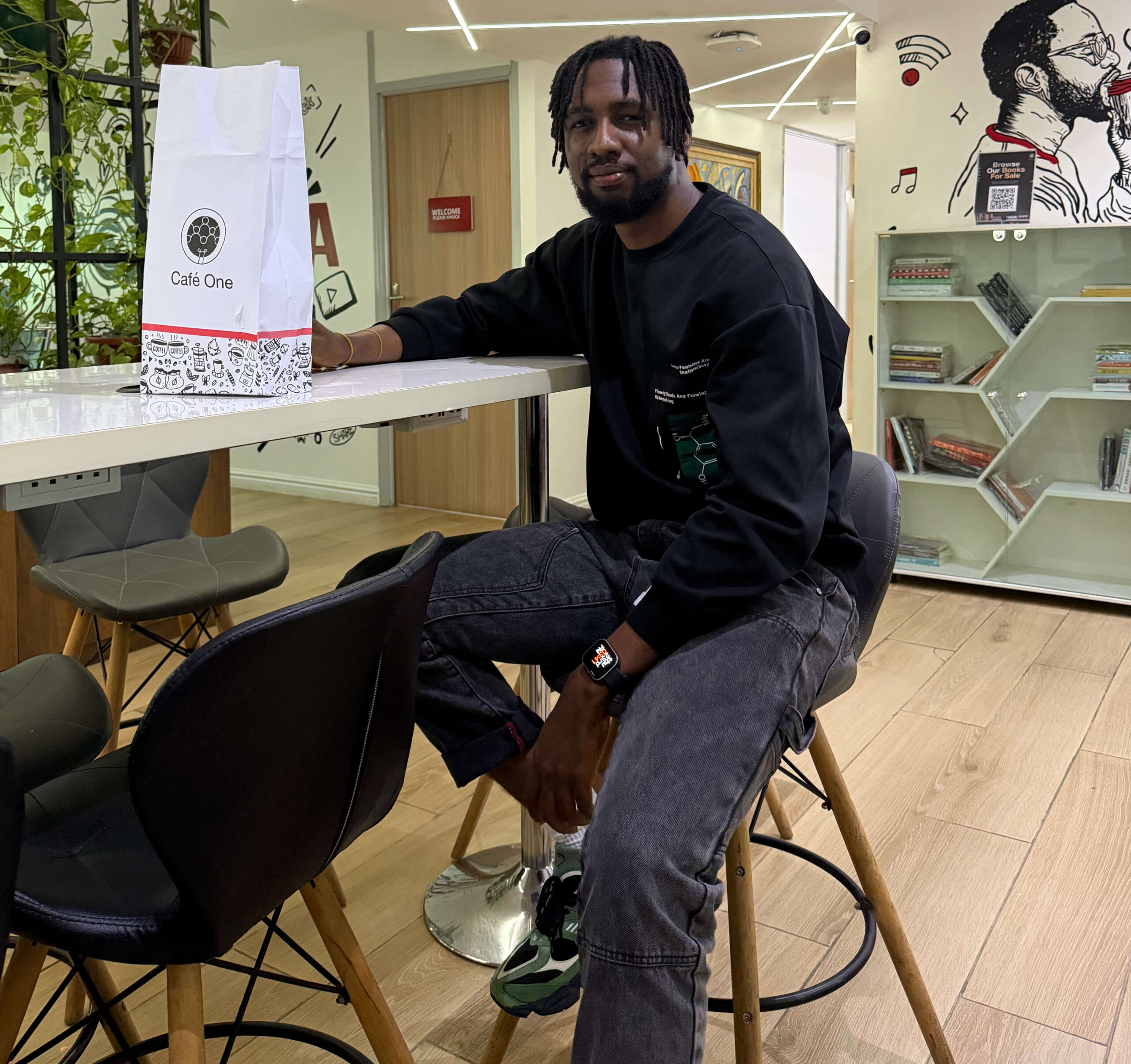
Taking my occasional coffee blend at the Cafe One, 20 Marina, Lagos.
For me, 2025 started with so many unrealized plans carried over from the previous year, but I did well to squash every single one of them by the end of the first quarter—Not a single one was spared. That also meant that my 2025 started kind of later than it should.
I had started 2025 with one clear purpose: to reach and touch more people than I have ever done within a single year. I love teaching a lot, and it is one of the ways of giving a bit of myself to every person that I meet. So to achieve this, I got more serious with social media, organically growing my Facebook following from 12K to about 20.5K followers.
In February, I took a 14-day leave from work. It was during this time that I came up with ZHero No-code Web Design Course. Thanks to encouragement from one of my Facebook friends and mentees, Increase Moses. As of the time of writing, the course has sold over 250 times, bringing together students from various African countries.
Got More Intentional with Friendships
I am an outspoken person and enjoy meeting new people, but I struggle to maintain close friendships long-term due to my unique interests. Throughout my life, I’ve kept only two truly close friends. Unfortunately, this year I had to make the painful decision to cut ties with one of them for personal reasons. I did my best, but it didn’t quite work out. Now, I have just one close friend, and we’ve known each other for at least 11 years.
Nonetheless, it’s worth mentioning some of the good social friends that I have been lucky to meet physically. Olumide Ayinla of PrintHouse Nigeria, Paul Axennic Ikonne & Family, and Safwan Idris.
This year, I also physically linked up with a UK-based client whom I have constantly worked with since 2017. He is one of my important clients, and meeting him was a dream come true for me.
On the other hand, I attended more events this year and met new people, but honestly, none stuck. The memories aren’t quite there. Typical me!
Showing Up for Family When It Mattered
I started investing more time showing up for my family—both nuclear and extended. I reached out to my grandmother when she was ill and showed up for my little sis on her Nikkah Ceremony in November, having previously helped with logistics during her relocation to their new apartment. I showed up for my cousin, DJ OP DOT’s Homecoming Concert in the same month. I paid two visits to Jaido P, who is also a cousin of mine, just to cool off and vibe. I love the concept of family so much, and I keep it sacred.
I Rewarded Myself Every Month
I am a father of three, which is already enough financial responsibility, but I still managed to get myself something every month, no matter how little. This single act kept me trimmed and helped me to stay happy, fulfilled, and youthful. I couldn’t afford the time to hit the gym, but I’ve always looked fit.
I love streetwear and sneakers a lot, so I spent so much money on those until it became an addiction. I am not looking to stop soon, though; I am just looking to make more money to finance that addiction. Bad Bunny, Nike, JFG, New Balance, Rhude, Fear of God, you name it. I started jumping in and out of boutiques.
I Wasn’t Prepared Enough
Since starting my full-time job at Sterling Bank as a Senior UX Web Design Executive three years ago, my lovely Branditechture took the hit. I no longer had the time to run it efficiently because priorities had to be reordered. Due to this, it had to be the sacrificial lamb in my quest for some corporate experience.
However, I have included the redesign of Branditechture in the course outline of my web design course, which means I’ll be killing two birds with one stone.
But this also means that I did not have the resources needed for some enterprise clients who reached out to work with me. To fix this, I locked in during the final month of this year and was finally able to complete the design of my professional corporate profile. With this, I am readily positioned to advance talks with most corporate clients who would come my way in 2026. It would also aid my proposal writing if I were to reach out to them first.
My Wins
I got my second car in two years—a Honda Accord 2010 EX-L.
Grew my 15-year-old Facebook Account from 12K to 20,500+ followers.
I got Monetized on Facebook via the Content Monetization Program (CMP.)
I bought shares worth 6M NGN for the first time in a year.
I acquired an iPhone 17 Pro Max at a time when it wasn’t commonly accessible. (It was a big flex.)
I got promoted at work—my second promotion in three years.
I created a Web Design Course that generated over 10 million NGN in sales revenue within the first ten months.
My Losses Lessons
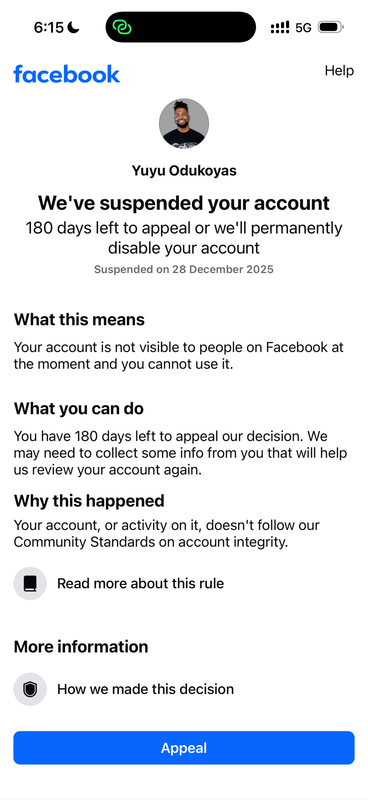
On Dec 28, Facebook suspended my monetized account. It was such a painful experience. It caused me real pain because I lost 15 years’ worth of irrecoverable memories. The account had most of my teenage photos, and it perfectly represented my journey and growth through life. Read the story here and the lesson learned here.
I lost a long-term friendship because we outgrew each other and started to have irreconcilable objectives. I tried to make adjustments and spoke about it, but it did not work out in the end.
What’s Next
Frankly speaking, I was surprised by how much AI democratized skill acquisition this year, resulting in a large influx of very young people into tech.
Things like AI Video Generation, AI Automation, MCP, Agentic IDEs, and the Vibecoding Culture blew up, and quite a lot of very young people milked it. This resulted in a seismic shift in the way talents are accessed, and HRs and recruiters are getting overwhelmed daily with massive volumes of entry-level applications.
Getting an enthusiastic freelance whiz kid is now as easy as scrolling through your Facebook Timeline or X Feed.
I’ll be honest—I’ve never felt this left behind in my life. I admit that if I’m going to sustain my reputation and position in this industry, then dedicating significant time next year to learning and researching AI tools, models, and prompting strategies has to be a top priority.
I will carry out a series of AI automation experiments using my various websites to see which ones are dependable enough for enterprise use.
I plan to build a new startup next year. I’ll reveal this in a future article, so please Subscribe to My Thoughts if you haven’t.
It will be interesting to see what 2026 brings, but I’m fully prepared and strategically positioned for whatever comes my way.
I did not just lose my Facebook account; I lost my Instagram and my Threads account in this same swoop.
My Facebook contained apps that I built, my business manager account, my Facebook Business pages, and thousands of photo memories from my teenage years. Facebook was my oldest and my first real social media platform, but on the morning of December 28, 2025, I lost access to every single thing I have created on these Meta platforms since my teenage years.
After more than 15 years on Facebook, a platform where I built an entire legacy, my account was suddenly and permanently suspended. How does a platform that I have given so much of my life treat me with so much robotic recklessness?
My phone shows that I spend an average of five hours a day on Facebook alone. Remembering this again forced me to think deeply about how I’ve been spending my time and how I want to spend the next 15 years of my life.
With that clarity, I’ve decided that if my accounts are not reinstated by Meta, I will NOT return to Facebook or its other Meta platforms, except WhatsApp, which still feels more human in how it handles issues when they arise.
No warning. No grace to look up and fix any account-related issue. Just a lockout after an appeal process that looks automated.
If you’ve ever known or interacted with “Yuyu Odukoyas” online, then you’ve known a version of me built with care, passion, and purpose. My real name is Yusuf Odukoya, but for over 3 years, I used my playful nickname as my Facebook display name.
That small detail—something that I had built the YUYU brand around—turned out to be the reason Facebook’s systems flagged my account.
And on December 28, 2025, they shut it all down.
In losing access to my account, I lost
15+ years of memories, friendships, messages, and posts
A loyal following of over 20,500 people
A community that helped me grow ZHero Web Design Course, where I’m mentoring more than 250 budding dynamic web designers
The primary platform where many people first discovered my work
Apps and automations that I have built on the platform
That page was part of me. It held stories, testimonials, creative ideas, growth moments, and connections that I truly valued.
The hardest part? No prior warning or advice, despite being a Meta Verified user two months prior. One would think that Meta Verified and 2FA would have given some real advantage in issues like this, but this is just another false sense of exclusivity sold by the Meta/Facebook Verified offering.
No “Hey, this name doesn’t match our records, please update.” Just a very cold execution.
For an account I’ve had since my teenage years, it felt very harsh, unjust, and inhumane.
But here’s what I have learned;
Facebook is not ours. No matter how long you’ve been there, no matter how much you’ve contributed, it’s jsut not your platform.
After the suspension, I thought, “Okay, data privacy rules globally enforce the ‘you own your data’ narrative,” but when I downloaded “my information” from Facebook after the penalty, all I got was a ZIP file that was just 4.4MB. That’s less than the file size of a single Facebook video.
What I found inside the ZIP file was a bunch of HTML files that basically just saved my bio and other Facebook-related preferences. Like, what am I supposed to do with all of that? 😅.
Where are my photos, Facebook? Photos of me when I was 17 years old are gone because of an automatically flagged “account integrity issue.” Photos of me at my matriculation and graduation ceremonies from the University of Lagos are also gone. Facebook, why?
I now have a gallery on my website, but it is nothing compared with thousands of my Facebook photos over the course of the last 15 years.
If you’re a creator, entrepreneur, coach, or mentor, please hear me: Don’t build your empire solely on borrowed land.
Strangely, the same night my account was suspended, I slept peacefully.
Why? Because I had taken one smart step a while back, I built my own website and started growing my newsletter list. That meant:
I could still reach people who mattered most
I had full control over my content, voice, and platform
I didn’t need Facebook to validate my work
Yes, the loss still stings. But it didn’t destroy me, because I wasn’t completely dependent on Meta’s ecosystem.
To anyone reading this, if you’re looking for me on Facebook, I’m not there anymore. And I won’t be returning. I’ve made the choice to stop using all Meta products, except WhatsApp, which, at least for now, still provides a reasonable appeal process.
More importantly, I’m encouraging you to take back your control of your life and destiny.
👉 Start your website. 👉 Build your email list. 👉 Diversify your online presence. 👉 Don’t wait until your account disappears to realize what you’ve built.
Building millions of followers on a platform that will destroy you in one night is never worth the work. You should commit your hours to owning independent systems, which will always preserve your legacy.