
Sometimes a web project might require that some sections maintain their in-line (or one-line) structure. On devices with limited width, this means that elements inside the horizontal scroll container become “swipeable.”
You can achieve this in Elementor by following the guide below.
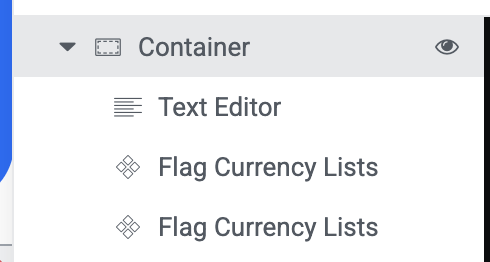
First, you need at least, two main elements here; The scrollable container, and its contents.
On the Structure Panel, you should have something like this;
Here are the exact things to do.
STEP ONE: Click the parent container. Then click “layout”. Ensure that the direction goes from left to right as seen in the screenshot below, then select “No wrap”.
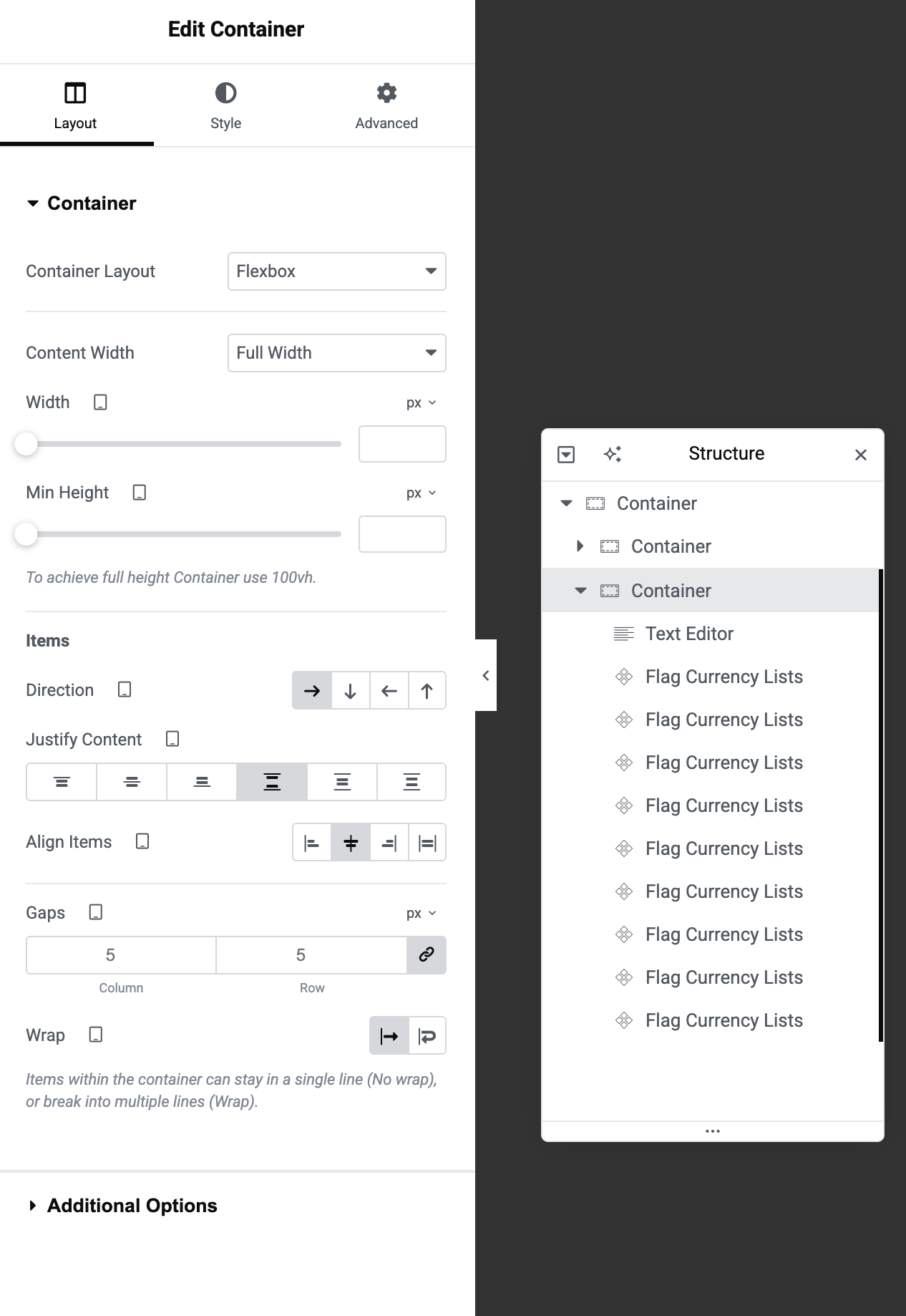
This forces the content of the container in-line, but the problem with it is that the content becomes squeezed. Which leads us to STEP TWO.
But before we move to STEP TWO, make sure you are still on the parent container, click “Advanced” and scroll down until you see “Custom CSS”. Paste this CSS Code:
selector {
overflow-x: auto;
overflow-y: hidden;
-webkit-overflow-scrolling: touch;
}

selector {
scrollbar-width: none;
}
selector::-webkit-scrollbar {
display: none;
}
STEP TWO: Now that we are done with the parent container. Click each single item (or widget inside that container,) and do this same thing (shown below) for each of them to get rid of the squeeze and make them stretch to fit their actual width.
Click one widget at a time, then click the “Advanced” tab then “Custom CSS”. Then insert this CSS Snippet:
selector {
  flex-shrink: 0;
}
This would make the widget stretch to its real width instead of squeezing to fit in the container.
Repeat this same thing for every widget inside that container. That’s it. Simple and flexible!


