
Ever been on a sleek website where the header magically disappears when you scroll down and pops back up when you scroll up?
It’s subtle, it’s smooth, and, let’s be honest, it makes the site feel 10 times more modern. For me, the biggest perk with this design implementation is that it gives more room for page content as you scroll down the page since the nav menu bar would be temporarily hidden.
This effect is (unofficially) called a Smart Sticky Header. There is currently no standard name for it, but you might better relate with the names below:
🔹 Scroll-Aware Header
🔹 Auto-Hide Sticky Nav
🔹 Reveal-on-Scroll-Up Header
🔹 Dynamic Sticky Navigation
🔹 Responsive Smart Sticky
Still didn’t catch that? Okay, I’ll explain.
Unlike a regular dumb sticky header that always remains stuck to the top of your view port, this is a header that:
• Stays fixed to the top of your page (Like the regular sticky header)
• Disappears as users scroll down (to keep content in focus)
• Reappears when users scroll up (so they’re never lost)
Perfect for blogs, product pages, landing pages, or any site where you want to balance content and navigation.
You’re designing a site in Elementor for a client who owns an e-commerce boutique.
She’s worried her customers might bounce because the menu keeps crowding the screen on mobile, especially among people with shorter displays.
The Smart Sticky Header Effect is what you need, and here’s the bundled snippet to use:
<style>
    .sticky-toggle {
  position: fixed;
  top: 0;
  left: 0;
  right: 0;
  box-shadow: 0 2px 5px rgba(0,0,0,0.1);
  transition: transform 0.3s ease;
  z-index: 999;
}

.sticky-toggle.hide-on-scroll {
  transform: translateY(-100%);
}
</style>

<script>
let lastScrollY = window.scrollY;
const threshold = 10; // avoid false triggers on tiny scrolls
const elements = document.querySelectorAll('.sticky-toggle');

window.addEventListener('scroll', () => {
  const currentScrollY = window.scrollY;

  if (Math.abs(currentScrollY - lastScrollY) < threshold) {
    return; // Ignore small scrolls
  }

  const scrollingDown = currentScrollY > lastScrollY;

  elements.forEach(el => {
    if (scrollingDown) {
      el.classList.add('hide-on-scroll');
    } else {
      el.classList.remove('hide-on-scroll');
    }
  });

  lastScrollY = currentScrollY;
});
</script>
Just copy & paste this CSS and JavaScript directly into your site, and any element that you add the class name “sticky-toggle” will automatically assume the smart hide/show on-scroll effect discussed above.
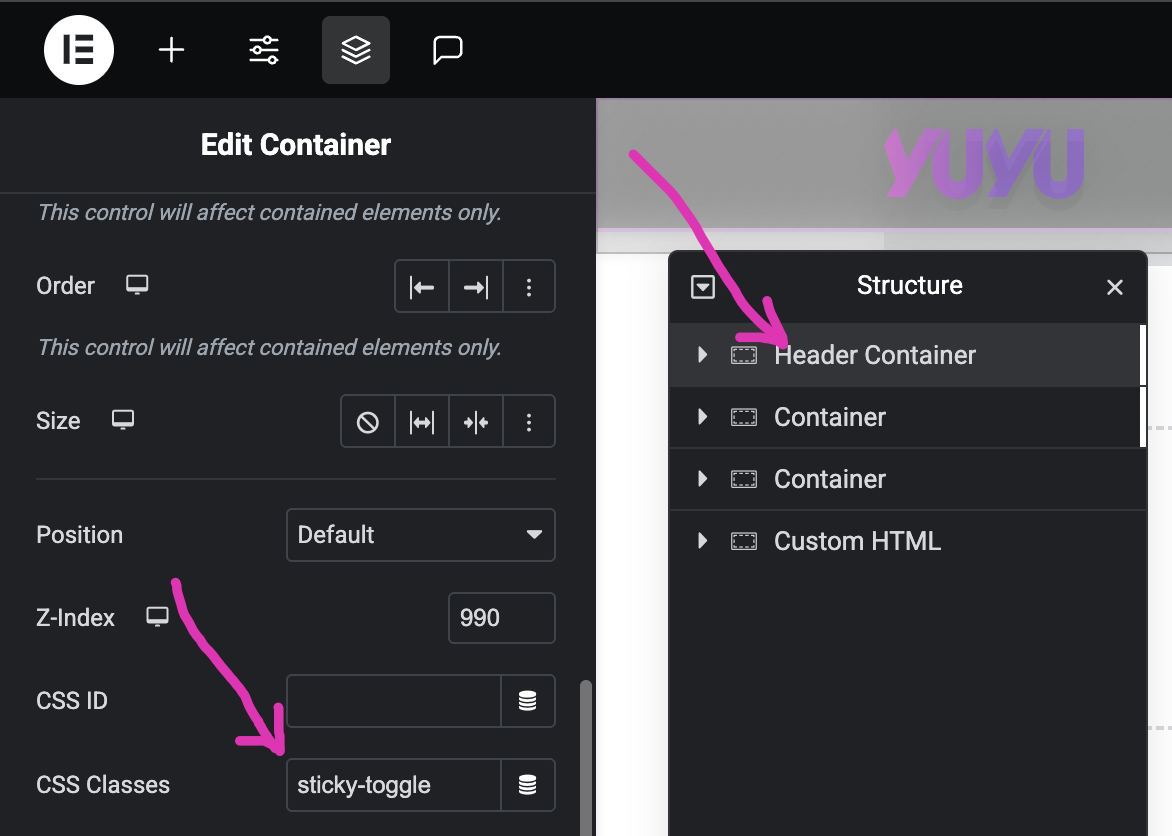
If you are a WordPress Designer like me that likes to use Elementor, you just need to add an HTML Widget in your header template, and paste the code.
Then click on the your nav header section, and add the class name “sticky-toggle“.
To ensure that this snippet works as expected, make sure that the code is the last in the order of content in your header template, so that it runs when other elements in the header template are fully loaded.
This one little trick gives your web design project a professional polish and real UX value.
It’s the kind of touch clients may not ask for, but will absolutely love once they see it in action.


